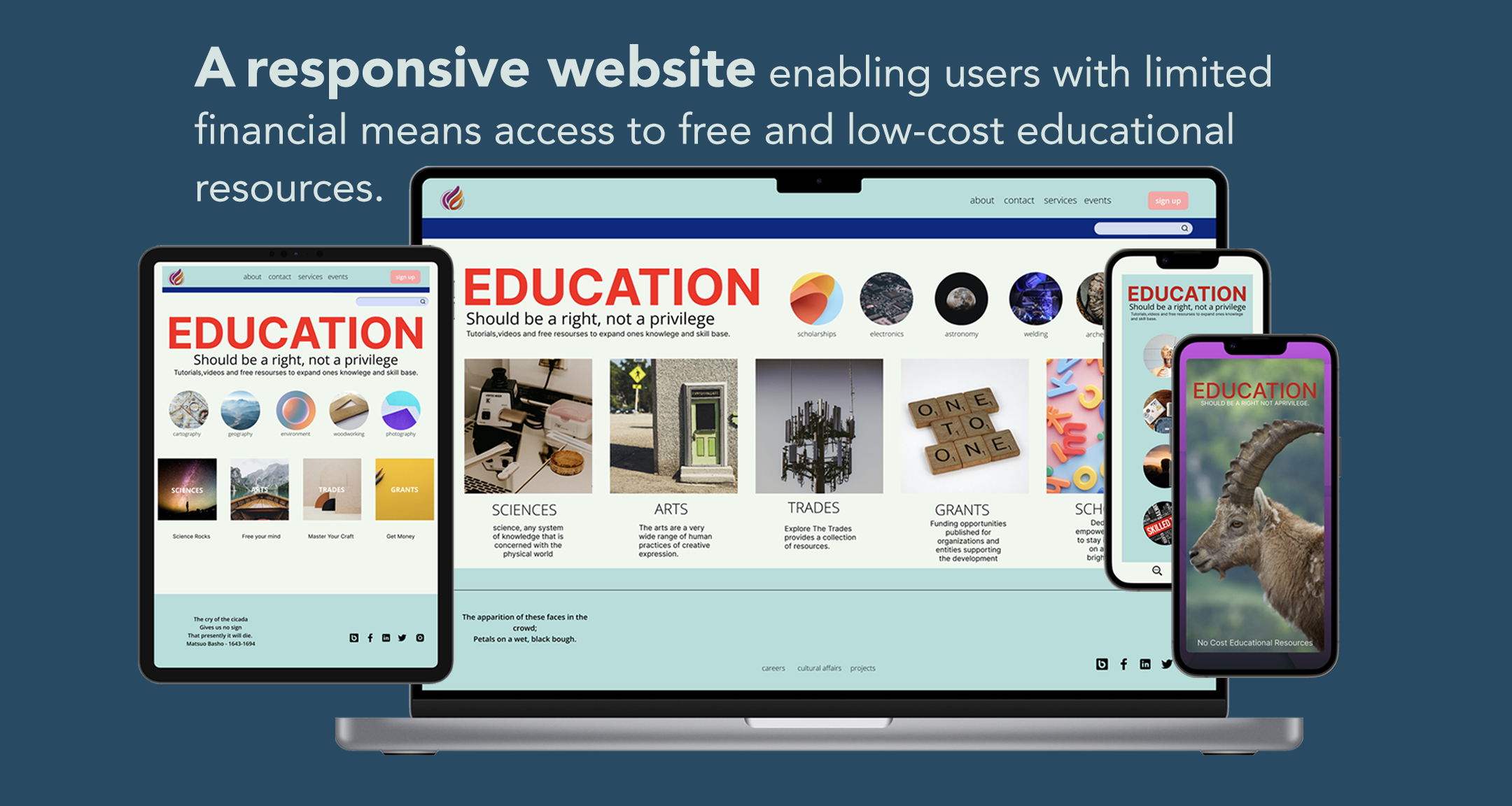
EDUCATION
SHOULD BE A RIGHT, NOT A PRIVILEGE
Project Duration
April 2022- June 2022
Responsibilities
Conducted interviews, paper and digital wireframing, low and high-fidelity prototyping, usability studies, accounting for accessibility, iterating on designs, determining information architecture, and responsive design.
Role
Solo project for google UX/IU Design certification.
Problem
Education opportunities are prohibitively expensive and out of reach for many people who do not have the financial means to gain access to resources.
Goal
My goal was to create a responsive website that makes educational-based information free, as well as opportunities, and resources easily accessible consistently from different devices.
Questions
· Can you describe your experience visiting a website or using a mobile app in gaining information for a particular topic or service?
· As a user, what platform do you prefer to use, website or app?
· Based on your answer can you describe why you prefer to use one over the other and why?
· What issues or challenges do you encounter using a mobile app when looking for information or a service?
· What issues or challenges do/did you encounter using a website when looking for information or a service?
· Is there any way in which you feel you can resolve these challenges?
Research
I conducted an unmoderated research survey with 4 participants ranging from age 40-55yo from various backgrounds to gain a better understanding of moving forward with the development of the platform.
Discoveries
The participants in my research expressed that some sites were too cluttered and disorganized with finding information about various educational resources. Some felt the information was outdated or not valid. Thus users want a platform that is easy to navigate, well organized and can access educational opportunities at no additional cost.
Wants your Data
Apps tend to want access to things on my phone so they may collect data on me.
Pain Points
Bad navigation
Website searches aren’t intuitive and need more prompts to narrow the search for specifics.
Requires Download
Apps require me to download something. Extra steps and time.
Affinity Map

PERSONAS
Sarah Lee is a small business owner who needs a streamlined workflow because she wants more time to be spent with her child.


Jules a former house painter taking in adventures needs to research new areas of interest he plans to visit because it improves his world views.

Jules User Journey
THE DESIGN PROCESS
I created a pathway to how the website will flow.
Information Architechture
click to enlarge.
Iterations
Paper Wireframes
After creating my preliminary IA diagram, I utilized that information as a guide to the iteration process.


Digital Wireframes
click on image to enlarge
click on image to enlarge
click on image to enlarge
Usability study
I reached out to 6 participants and conducted an unmoderated remote usability study that took 10-15 minutes to complete.
Discoveries
Easy to find
Needed quick access to educational resources.
Legible and Clear
Captivating graphics and color scheme that's easy on the eyes.
Simple to Use
Hassle-free navigation without having to go through unnecessary steps.

The Outcome


High-Fidelity Prototype
When it came to the mobile version, I made the button icon feature large giving the user a clearer view on a smaller screen.
Responsive Mobile Version


Interact with prototype here
Participants observation

“I like the look of the app – from your statement on the “front” page that education should be a right, which sets the tone as uplifting and optimistic, to the picture tiles, which draw the viewer’s attention and contribute to an overall attractive and modern feel.”
– Professor Burkart PhD.
Accessibility Considerations
Clear Icons for interactive elements that can be read by screen readers.
The initial focus of the home screen on personalized recommendations helps define the primary task or action for the user.
Reflections + What I Learned
I learned that having access to knowledge and learning should be a human right. Thus, creating a platform that makes it accessible for all is a logical step in the process. I learned that the right color combination and shapes should be easy on the eyes and accessible to all users.
Next Steps
I would like to expand the usefulness of this site by incorporating VR AR and that focus on mental and physical health.
Create multiple language options and a section where people can contribute additional information.

