

THE BIKE CORPORATION
A responsive website for those that want customized frames or high-end bike components.

Project Duration
Feb.2022-April 2022
Role
Solo student project for Google UX Design Certification.
Responsibilities
Conducted user research, paper and digital wireframing, ideation low and high-fidelity prototyping, usability studies, competitive audits, and design iterations.
Problem
There are limited options in which a person can have a bicycle customized to fit the users needs.
Goal
Design a responsive website that caters to customers that want a handmade bike frame or high-end components to help improve competitive cyclists' performance.
Research
I conducted unmoderated usability research with 6 people between the ages of 25 and 57 male and female to get an idea of their online shopping habits. Out of the group of interviewees, some were casual cycling enthusiasts others were amateur competitive cyclists.
I discovered users like to shop online because of its convenience. Additionally, the user longed for the website to be the local connection to the cycling community that wasn’t available on other websites.
Questions
1. When and how often do you visit a website to shop for something and why?
2. If you were to buy an item online(why), what do you look for and why?
3. What do you like or dislike about shopping online and why?
4. How does it make you feel, and why do you feel that way?
5. What is most important for you when you are shopping online and why?
6. What would you say is the most difficult when you are searching for a product, and why?
7. Tell me about your experience/s the last time you shopped for an item and what was that experience like?
8. What features are you drawn to or annoyed with on a website and why?
9. What features would you like to see on a website that would make it a pleasurable experience?
Unnecessary options
Too many options are not related to what the person is shopping for.
Pain Points
Items out of stock
Finds an item and when added to the cart, the product is out of stock, or the number of items left is not noted.
No local shops
No local bike boutiques offer an option for custom handmade frames.

Jasmine is an environmental biologist and competitive cyclist who needs spare parts on hand because she needs to make repairs to improve her bike's performance
Persona
.

Jasmine’s Journey Map

Information Architecture
I used this sitemap as a starting point on how one can browse the website and used it as a reference to iterate from.
The Design Process
Paper Wireframes
As the starting point for the sitemap, I sketched a series of paper wireframes to get an idea of how the basic premise of a responsive website the la website will evolve.

Transitioning from Paper to Digital
Digital Wireframes
Taking a cue from my paper wireframe iterations I created a series of digital iterations to gain functional clarity as I worked toward meeting the users’ needs.


Responsive Version
Usability Study: Findings
Based on the usability study and feedback, I made further modifications that addressed the users’ needs.
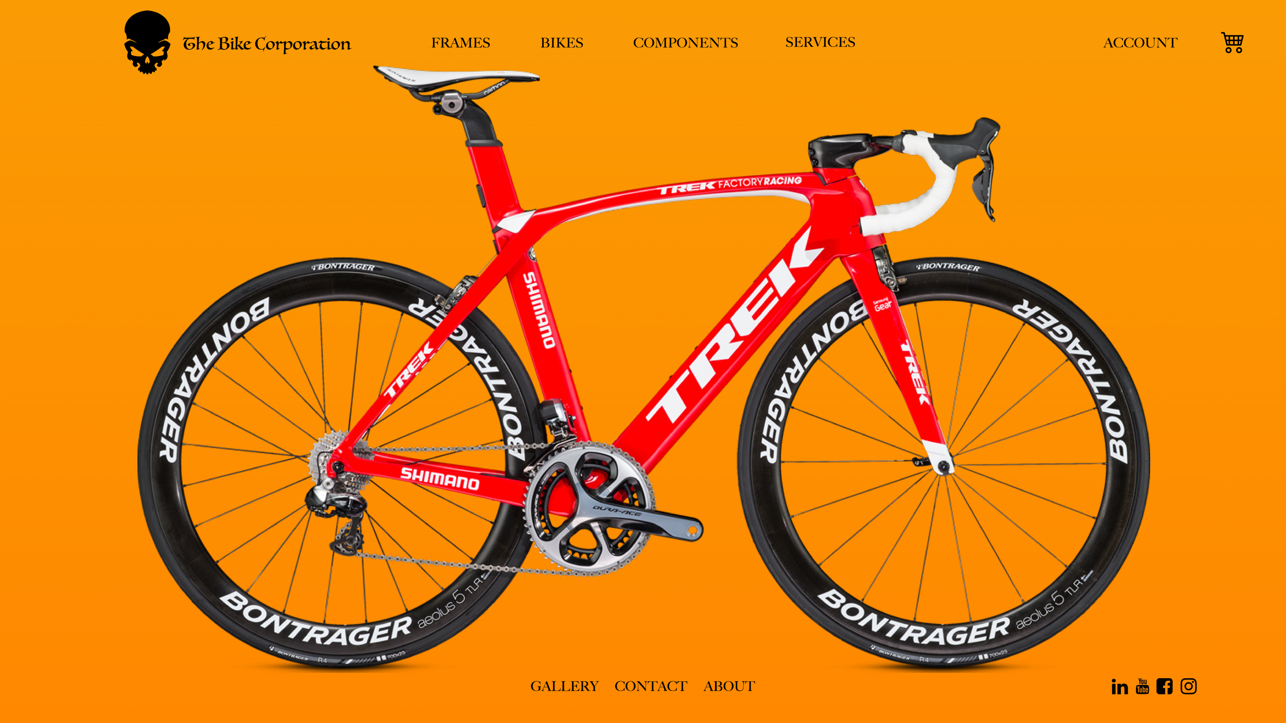
Home page
On the homepage navigating to a page to shop was obvious and simple.
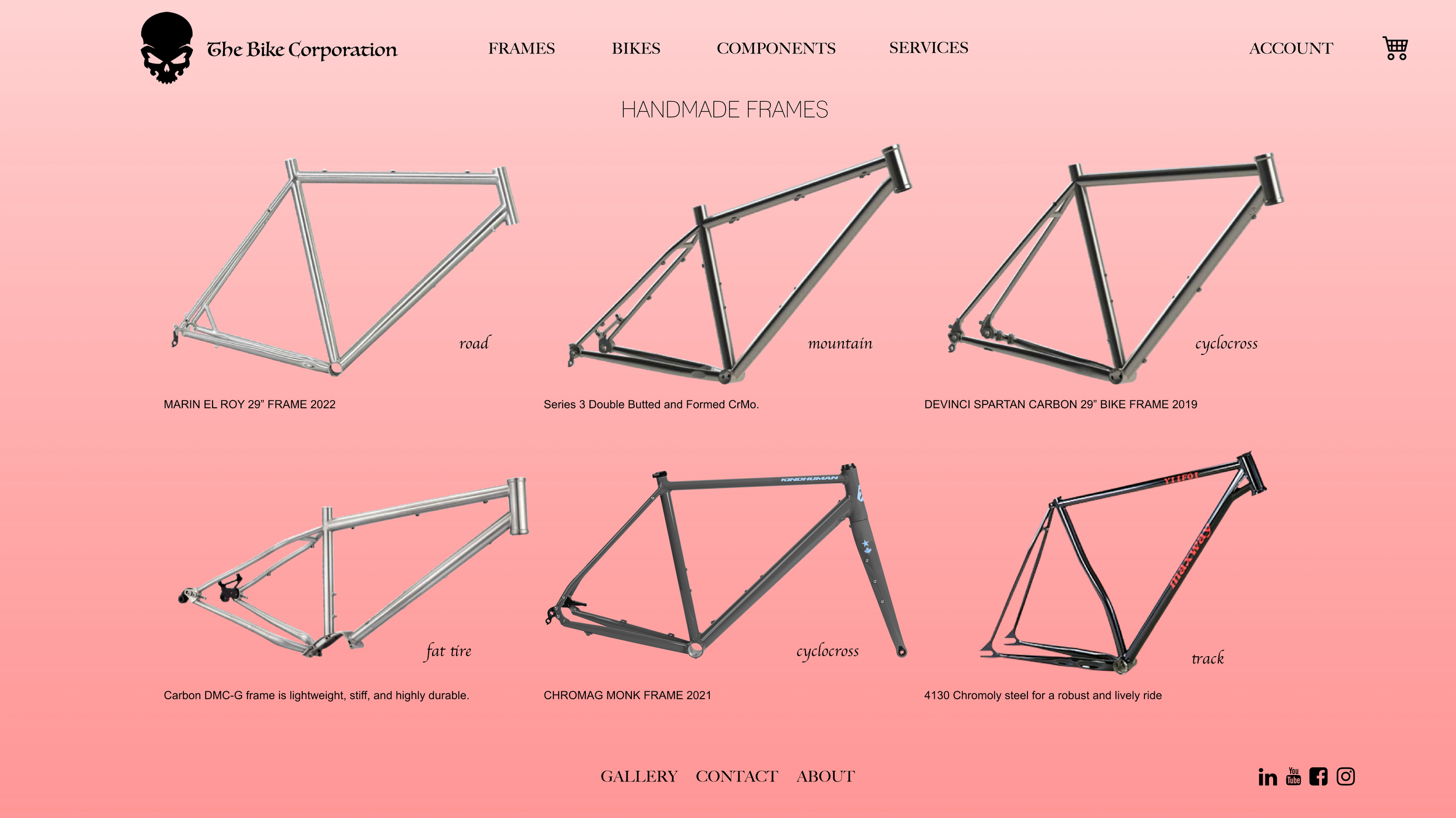
Bicycles page
It was easy to shop for different types of bikes and when an image is clicked on it reveals more information about the products. Additionally, there’s the option to add to cart, and or continue shopping or checking out
Account
It was simple and easy for the user to sign in or create an account.
On the original layout, I had each component of the bike icon as a hot link to its respective source which in turn added clutter. I utilized the minimalist approach to clean up the landing page. by getting rid of that feature.
Final Prototype Iteration


Prototype
Feel Free to interact with the web version prototype.
Mobile Version
I refined the mobile version by enhancing certain features making the user experience more intuitive. For example, I kept the layout clean and made the icons and buttons larger.
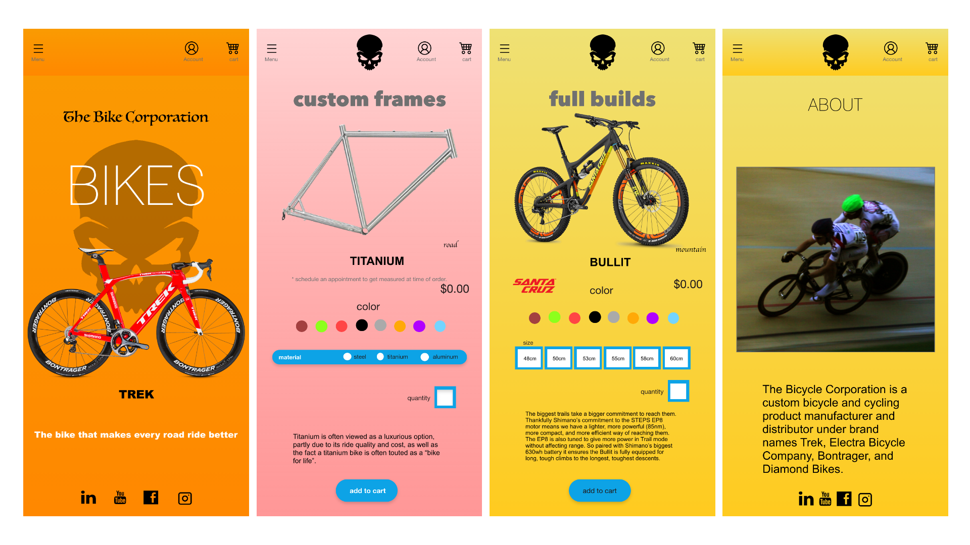
Accessibility Considerations
I made sure the icons were large and easy to identify.
Once a product was chosen and added to a cart the option to check out or continue shopping is unobstructed and simple to interact with.
The navigation features were located in the center of the pages which are visible and easy to access.
Takeaways
User Impact
“I think it looks good and flows well. The home page is eye-catching, with the big bike and the skull.”
-Dr. Childers

What I learned
As I gain more experience and discover new ways of problem-solving, I’ve learned that clean design and effective color considerations improve accessibility and overall positive user experience. Again, the challenging part for me is the research portion of the project. I would have liked to do more iterations next time which would lead to more discoveries in finding optimum results.
Next Steps
Continue to fine-tune the website and follow up with additional usability testing.
Expand additional features and incentives that improve the user experience.